Connor Harris As Media Studies
Tuesday, 15 March 2011
Friday, 11 February 2011
Saturday, 29 January 2011
Production: Editing
All-together it took us about 2 weeks to complete the editing process. This was due to us changing various elements of the opening's layout etc.
We decided to cut out the parts that we added in (shown in a previous post) and simplify the way in which the film runs, as we thought that too much happens in the opening. We finally edited the film opening so that it tells less of a narrative structure however, in our opinion, worked better and was more effective.
We only needed to film a few more shots which we would then add on to some of the other shots we had previously used. The use of several titles were also an effective way of improving the intensity of the opening sequence.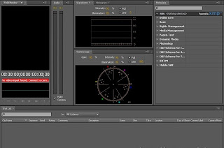
When we had finished filming the new shots, we used Adobe On Location again to firstly capture them off the tape. Once this had been achieved, we could import them into Adobe Premiere so that they could be edited and ordered properly.
This programme allowed us to do lots of things to our shots to make the opening more entertaining and effective.
Firstly, it let us split up the sound from each of the separate clips. This came in handy because we wanted a sound to be 'repeated' throughout the duration of the opening sequence - but without the camera noise in the way; therefore we deleted the sound off each clip and replaced it with a sample of some heavy breathing that we had filmed previously.
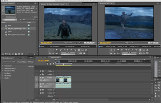
Also, Premiere allowed us to add video and audio effects/transitions to our shots. We used a lot of cross fade on the audio so that the sound ran more smoothly throughout the video (so it wouldnt quickly cut out). In addition to this we used some video transitions on the final title of the sequence. We added a 'fade' effect which the title more of an eerie feel to it, making it more believeable.
Titles also play a big part in our opening sequence. We used them to display actors names, production companies (which we made up) and the title of the film. Not only this, but we were able to find a relevant font type specific to our genre which we thought worked simply, but well. It also gave us many other options such as height,width and positioning of the text.
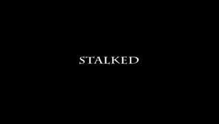
Above is our final title which shows the name of the film. We went for a simple layout as was mentioned before because we felt that it added to the intensity of the opening sequence.
Overall, I think that Premiere was very good at aiding us in completing the task as it allowed us to play around with effects and gave us some ideas as to what could be done to the audio/visuals on some shots.
We decided to cut out the parts that we added in (shown in a previous post) and simplify the way in which the film runs, as we thought that too much happens in the opening. We finally edited the film opening so that it tells less of a narrative structure however, in our opinion, worked better and was more effective.
We only needed to film a few more shots which we would then add on to some of the other shots we had previously used. The use of several titles were also an effective way of improving the intensity of the opening sequence.

When we had finished filming the new shots, we used Adobe On Location again to firstly capture them off the tape. Once this had been achieved, we could import them into Adobe Premiere so that they could be edited and ordered properly.
This programme allowed us to do lots of things to our shots to make the opening more entertaining and effective.
Firstly, it let us split up the sound from each of the separate clips. This came in handy because we wanted a sound to be 'repeated' throughout the duration of the opening sequence - but without the camera noise in the way; therefore we deleted the sound off each clip and replaced it with a sample of some heavy breathing that we had filmed previously.

Also, Premiere allowed us to add video and audio effects/transitions to our shots. We used a lot of cross fade on the audio so that the sound ran more smoothly throughout the video (so it wouldnt quickly cut out). In addition to this we used some video transitions on the final title of the sequence. We added a 'fade' effect which the title more of an eerie feel to it, making it more believeable.
Titles also play a big part in our opening sequence. We used them to display actors names, production companies (which we made up) and the title of the film. Not only this, but we were able to find a relevant font type specific to our genre which we thought worked simply, but well. It also gave us many other options such as height,width and positioning of the text.

Above is our final title which shows the name of the film. We went for a simple layout as was mentioned before because we felt that it added to the intensity of the opening sequence.
Overall, I think that Premiere was very good at aiding us in completing the task as it allowed us to play around with effects and gave us some ideas as to what could be done to the audio/visuals on some shots.
Thursday, 27 January 2011
Updates:location
With the new shots that we added we needed a second location to film them to show that they are at different periods of time in the story. We decided to film these shots at Worcester Woods Countryside Centre because we felt this was relevant to what was happening in the sequence.
Updates:filming
Thursday 13th January 2011:
We decided that our film opening did not give enough of an idea of what the main character is like or why he is bein followed, therefore we decided to add some more shots in which will be placed at the beginning of the film to create more of a narrative structure.
We also took on board some of the feedback that we were given and have also included a POV shot of the mysterious figure in the bushes. We felt that this would help to create more tension in the opening and ultimately make it more scary.
For the new opening shots, we also included a new actor:
Role | Who? | Photo |
| Innocent Little Boy | Jake Walden |  |
Production:filming
5th January 2011:
We first attempted filming on the 5th January 2011. We went to our location with our actors, however it was too dark for the camera to capture anything. This meant we had to postpone filming to the 7th January; a time when both of the actors were next available.
_________________________________________________________________
7th January 2011:
All of the filming was done on this day and it took us about an hour to finish it. Filming went relatively smoothly with only a couple of shots taking more than one take. We decided to capture Shot 13 in various ways so that we could choose which method of filming we thought was best/most effective.
We did not shoot each shot entirely in order however. The order we did them in is below (Refer to Shot List blog post for description of each shot):
- Shot 1
- Shot 6
- Shot 7
- Shot 8
- Shot 9
- Shot 10
- Shot 11
- Shot 12
- Shot 13
- Shot 14
- Shot 15
- Shot 16
- Shot 17
- Shot 3
- Shot 5
- Shot 18
Organisation: Props/costume
We will not be using any props in our film opening. This is because we did not think that they were necessary for the project.
The costumes in our film will consist of everyday clothing that is typically associated with teenage boys. One of the characters you do not get to see much of anyway therefore his costume will also be like this. We did not feel that we needed any other costumes for the cast.
Wednesday, 5 January 2011
Audience research: Updates
I uploaded our animatic to our focus group on Facebook and got some feedback from not only people of a similar age to us, but also in the 30-40 age range.
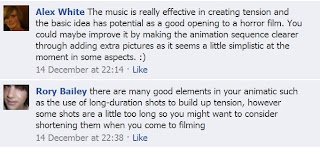
Here is what 2 of our friends (Alex White and Rory Bailey) said about our animatic:
Sarah Moody represented the opposite end of our target audience age range. Here is what she had to say about the animatic:

We have taken this feedback on board and plan to make some changes to our project when we come to filming. We may choose to add some shots in to answer questions about the characters etc. or get some POV shots to help build tension in the opening.
Here is what 2 of our friends (Alex White and Rory Bailey) said about our animatic:

Sarah Moody represented the opposite end of our target audience age range. Here is what she had to say about the animatic:

We have taken this feedback on board and plan to make some changes to our project when we come to filming. We may choose to add some shots in to answer questions about the characters etc. or get some POV shots to help build tension in the opening.
Organisation: casting
The two characters who are in our film opening, the innocent person who gets followed and the stalker who does the following, are being played by Rory Bailey and Chris Hasell respectively. We have chosen these people for our opening because we believe they are reliable and suit the roles well.
Rory Bailey Chris Hasell
Cast meeting held on: 17/12/10;
Attended by: Miles Hardman, Connor Harris, Chris Hasell and Rory Bailey;
Key decisions and action points: Decided who would be playing which character and where would be a suitable location for filming.
Organisation: Location
For our media project we have chosen to film in Nunnery Woods. We felt that this will create the desired atmosphere. As this is a public wood, permission was not required. It was also a big advantage that it is very close to our college meaning hat we would need to travel far.
Tuesday, 4 January 2011
Risk assessment
| Potential Danger | Potential outcomes | Actions to avoid potential outcomes | Further comments |
| Tripping over roots | Serious injury, | Watch out for roots on the floor. | |
| | | | Me miles will be in charge of making sure all equipment is out of the way so that is is not a hazard to anyone. |
| | | | |
| | | | |
| |
Above is our risk assessment for our media project. It shows the dangers that are specific to filming in our location.
Wednesday, 15 December 2010
planning: Shot list
This is our shot list for our film opening. It describes each shot in the opening and what they are of. This could change as we get feedback.
Updates: Opening Animatic
Here is the animatic that we made for our opening sequence. We used adobe premier to make this and then added copyright free music this.
Updates: Opening synopsis
Here is the initial idea for our opening however, it is likely to be changed as we get feedback.
A girl is alone in the woods at night. The only sounds heard are diegetic sounds of various animal sounds, other than that there is silence. There are plain black screen with titles over it. It then wipes to another shot of the girl. This then wipes back to a black screen with titles. It then goes back to another shot of the girl. As the girl walks further through the wooded path she becomes increasingly scarred and tensions builds. She hears a noise behind her that sounds like footsteps, she looks around and nothing is there. She hears it again but this time when she turns around there is a silhouette of something in the distance. This thing starts running towards her. The girl then starts running screaming etc, the person keeps gaining on her. The girl then gets lost at a dead-end in the woods. The person catches her up and grabs her. We then hear a shriek from the girl as the camera is turned away so that we don’t see what happens. It then cuts to another plain black screen with the name of the film on.
A girl is alone in the woods at night. The only sounds heard are diegetic sounds of various animal sounds, other than that there is silence. There are plain black screen with titles over it. It then wipes to another shot of the girl. This then wipes back to a black screen with titles. It then goes back to another shot of the girl. As the girl walks further through the wooded path she becomes increasingly scarred and tensions builds. She hears a noise behind her that sounds like footsteps, she looks around and nothing is there. She hears it again but this time when she turns around there is a silhouette of something in the distance. This thing starts running towards her. The girl then starts running screaming etc, the person keeps gaining on her. The girl then gets lost at a dead-end in the woods. The person catches her up and grabs her. We then hear a shriek from the girl as the camera is turned away so that we don’t see what happens. It then cuts to another plain black screen with the name of the film on.
Friday, 3 December 2010
Genre research summary
In the genre of horror, the titles used follow a general pattern. Many titles are red to connote red or danger. They also seem to be quite slow pace to create a sense of suspense and tension. The contents of the titles is usually quite little, where it would perhaps only contain the name of the film and possibly a few producers/directors names.
The music used in opening sequences tends to be quite slow paced to create an eerie and spooky atmosphere and therefore creating tension. However, there is sometimes no music at all, with possible some talking or diegetic sound, this also builds a sense of tension.
Usually, in opening sequences, we see very stereotypical characters, this allows us to know a fair bit about the character without the film having to show their background. However, sometimes we get the opposite where the characters are quite plain so there is nothing really to know about them apart from if they're male or female. This allows the story to show who the characters are and what they are like.
The settings of horror film openings generally tend to be places that are isolated , where no-one is around to help or seem what is about to happen, therefore a sense of isolation and vulnerability is created. The lighting is usually quite dull, mainly because it is at night that most openings happen but also so an eerie and spooky feel is created.
Nearly all the time in horror openings the enigma theory of creating questions and a mystery is employed. For example in the opening to '28 days later' we see the main character alone in empty streets in a large city. This makes the audience want to know more and to watch the rest of the film.
Editing can vary in horror film openings, it can either be very fast paced to connote a sense of panic, but also it can be quite slow to create a spooky and eerie atmosphere. The kind of shots used tend to be close ups of characters so that not too much of the character is given away. However in ' The shining' for example we get an extreme long shot of the car, but this is also used so that not much is given away.
Wednesday, 1 December 2010
Audience research focus group
To get feedback on our initial ideas, we created a focus group on Facebook and uploaded our genre mood board so that some people could see it and give feedback.
Kurt Jackson and Callum Moore commented on this and give us feedback, which you can see in the screen shot below:
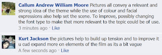
Both Callum and Kurt are stereotypical teenagers who are into the same sort of things that can be seen in our audience mood board. This is why they were chosen for feedback as they represent our target audience.
They also both agree that the opening sequences that we have chosen to analyse give some good pointers for when it comes to filming our horror film opening, as they use many advanced techniques and also are some of the best of the genre.
Not only this but they both enjoy horror films and they say that they would probably enjoy our opening sequence if we were to follow the elements seen above and in the opening sequences we chose ('Scream' and '28 Days Later').
Target Audience
Below is a moodboard we have made to show our target audience. It shows what sorts of things they are generally into as consumers: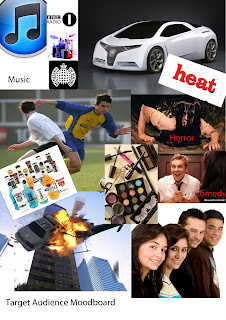 Demographically, the social grade(s) that apply/ies to our particular target audience would be grade C1-C2 . This would generally be people our own age (16/17) up to people about 20/21 of both genders.
Psychographically, our film will appeal mostly to Hedonists. People our own age will generally be Hedonists, as you may be able to tell from the above moodboard, however it could also appeal to a mainstream audience and possibly even individualists.
 Demographically, the social grade(s) that apply/ies to our particular target audience would be grade C1-C2 . This would generally be people our own age (16/17) up to people about 20/21 of both genders.
Psychographically, our film will appeal mostly to Hedonists. People our own age will generally be Hedonists, as you may be able to tell from the above moodboard, however it could also appeal to a mainstream audience and possibly even individualists.
Film Openings; Genre specific analysis
We analysed two different film openings for the genreof horror and looked at how the methods of producing meaning are specific to this particular genre.
We looked at the openings of 'Scream' and '28 Days Later'. The former follows a restricted narration as we are only following one particular character in the scene. This helps to create suspense/tension as we only know what this character knows and nothing else. This means that when an event happens it comes as a shock to the character and viewer and makes the scene scary.
Likewise, this is evident in the opening to '28 Days Later'. We again follow only one character therefore creating ellipsis in a way, meaning we are scared and get shocked when something happens to the protagonist.
In 'Scream', the character we follow appears to be a stereotypical American teenage girl. This adds the scene as it makes her seemingly vulnerable and in need of protection. The fact that she is alone in the house also adds to this tension.
This sense of helplessness is shown in '28 Days Later' too because we get very high angle crane shots when he is wandering around the deserted London because this gives us the idea that he is small and vulnerable in comparison to the huge buildings around him.
In the same movie, the non-diegetic music that is played at the start creates a gloomy/eerie mood which again suggests that this is a horror film in contrast to a comedy or action film.
In 'Scream' however, we do not relly get any music, diegetic or otherwise. This is effective though and creates tension and achieves the same effects as the other film opening as the lack of music in the scene connotes a sense of being alone and helpless.
In 'Scream' we do not get much of an introduction to the protagonist other than her name and some other general information about her. This gives the reader the impression that she is not a very important character and that she is about to meet her demise. This, again, connotes a sense of fear and builds up tension in the scene as the audience is wondering when she is going to be killed and where.
In '28 Days Later', however, we get various close-ups of the main protagonist to show the audience that our attention is on him and he is the one we will be following throughout the story and that he wont die straight away but instead we will learn more about him later on. We also discover a little about his character through his actions on screen, however we don't learn much about him again connoting isolation along with the deserted city streets
Genre moodboard
Above is our genre moodboard. As you can see we are concentrating on the genre of horror and these are some of the elements, that we think are relevant to the type of horror we will do, that will be included when we come to filming.
First ideas
I will be working with Miles Hardman on this project.
Target Audience: C1, C2, D and E (teenagers - middle aged males and females);
Potential Ideas: Third person narrative, opening scene to give idea of character types, 5 stage theory (?), gloomy, spooky mood/tone from the use of slow duration shots in contrast to quick cuts to connote action;
Location: Possibly wood at night, somewhere with an eerie feel to it to create tension.
From script to screen: How does the credit sequence from Dexter work?
Eric Anderson's ideas started off as simple concepts. He first realised how much he's fascinated with crime scene photography. He said that ' as a kid I loved looking through my grandfather's True detective magazine collection.' He thought that crime scene photographs gave mundane objects an overwhelming and sinister importance. For example this image is just an ordinary window until you find out that it was that window that Martin Luther King was shot at from.
He also like that work of Two other people; He spoke of ' David Byrne's book 'Strange Ritual' full of wonderful photos of nothing, and how in the simplest way, Mike Kelley made the cutest most usual things incredibly naughty.
But a big concept that Eric thought about was that if you flip the name Dexter upside-down then most of the letters are the same apart from a couple. This represents also how the character is like. He has a normal side but when he becomes the serial killer(the flip side of himself) he doesn't under-go a big change, he's still the same person just that something different, something's wrong. This is also shown in the opening because very normal things are filmed to look like they are sinister.
I think the actual opening sequence shows this sense of normality with a dangerous flip-side, by filming very ordinary objects and actions very close which creates a very sinister feeling. These shots also have a very shallow depth of field. In the opening we see drops of blood in a sink and also some eggs being cooked. This could be a very normal thing to have a bleeding cut after a shave but the close ups of the blood drops make it seem violent and sinister.
Noir lighting is used to add atmosphere. This is done by using very precise and focused lighting, this could represent how the character is also precise in being a serial killer, it also makes the opening and the character seem quite evil. However there is also lots of shadow and darkness in the opening that is quite dominant over the light. This gives the opening a dark and spooky feeling to both the character and the program. The shallow depth of field used help you focus on the details on the meat for example. This adds a tense atmosphere and makes the shot quite disgusting so the viewer feels squeamish.
The original Xploding Plastix track was originally chosen for the title sequence, however it created a feeling that the producers thought was not right for this opening. It was then replaced by another piece of music which worked very well and had the right feel to it.
The original piece made the fact that he's a killer too obvious.The music connotes an almost comical feel giving the opening titles a sort of split personality. This is also very prominent within Dexter as a character because at one point he is a dark, mysterious killer, however at other times he is a supposedly innocent forensic detective.
Research: Juno opening sequence
We researched more specifically into the opening sequence of Juno. Here are different conventions from Juno and what each connote:
The music used in this clip is quite childish. The singer, Barry Louis polisar, produces children's music and not serious grown up music connoting that she's not part of the grown up world even though she's a teenager who is meant to be grown up. The songs lyrics gives images of love and romance which possibly connotes how this character is alone and wants love in her life.
Lots of the opening sequence is animated, this connotes again that this character is quite childish, this is because the animation is in a style that looks like its a doodle by a young person. As well as showing that she is a childish character, it shows that the whole film could be quite childish. This could also show that she's different to everyone else because as she's walking she goes into a world of her own that is once again quite childish looking.
Also in this animation part everything seems very simple and colourful compared to what possible she's sees as being a complex and dull world. Also throughout the animation nothing bad happens, she seems happing just living in her own world. However, when we come out of the animation we can see that she's goes into a drug connoting that something slightly more serious is happening. Therefore this opening sequence could be seen as a representation of the journey she is taking in life where sooner or later she has to grown up and we can see this from how she's first of all in her own little world but then has to grow up when a more serious matter arises where she has to go to the drug store.
If you look just at the character, you can see that her clothes seem quite colourful and in her hand is jug of Sunny-D which is a very average, stereotypical child's drink connoting that she is a child in a grown up world and that she wants to be different, which is why we see her in her simplistic and different view of the world.
Also, if you look at the scenery around her you can see that it is very average and quite plain. This could connote how she views the world around her to be very average and dull or it could also connote that she is an average girl who lives a very average life. You could say this because she is walking down an ordinary street wearing average clothes.
Monday, 29 November 2010
Key conventions
We researched into opening sequences by watching various openings such as Kick-Ass, Brick, London-Brighton, Shifty,In Search of a Midnight Kiss and Train spotting and this is what I found to be the typical conventions :
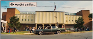 The main points of an opening sequence are that introduces us to the different characters and therefore the actors/actresses playing those roles, such as in Kick ass we can tell through the opening sequence that Dave is a very normal person although lacking in female attention. It should also perhaps use Barthes Enigma code theory so that Different questions are raised such as in Brick, straight away there is a mystery as to who the girl etc. Opening sequences should also gives us a sense of time and setting such as again in Kick ass we can see in the opening sequence a normal maerican type neighbour hood street and also stereotypical american highschool, and over the top of this, at one point, we also see 'six months earlier'.
- First of all they have the titles including producers names, directors an actors/actresses. Usually with music but can also have no music which can create a very different effect. For example in London to Brighton we see just a black background with titles over the top. This creates a big suspense and a mystery of what is gong to happen.
- Another convention is that voice-overs are used over the top of footage of different characters. This allows to get to know the characters.
- There is sometimes writing over the top of the film such as 'six months earlier' seen in Kick ass. This gives us a sense of time so things make sense when watching it.
- There are also freeze frames used to to show the different characters.
- Another convention is that the enigma code is used where questions are created for example in brick where the boy is looking at the dead girl, we want to know what's happened to her, who she is and what's his involvement in the situation.

 The main points of an opening sequence are that introduces us to the different characters and therefore the actors/actresses playing those roles, such as in Kick ass we can tell through the opening sequence that Dave is a very normal person although lacking in female attention. It should also perhaps use Barthes Enigma code theory so that Different questions are raised such as in Brick, straight away there is a mystery as to who the girl etc. Opening sequences should also gives us a sense of time and setting such as again in Kick ass we can see in the opening sequence a normal maerican type neighbour hood street and also stereotypical american highschool, and over the top of this, at one point, we also see 'six months earlier'.
Wednesday, 17 November 2010
Main Task
Our task is to create the titles and opening of a new fiction film to last a maximum of two minutes.
These are my deadlines:
These are my deadlines:
- Research Deadline: 26/11/10
- Photo-storyboard Deadline: 3/12/10
- Filming Deadline: 07/01/11
- Production Deadline: 28/01/11
- Evaluation Deadline: 11/02/11
Friday, 15 October 2010
Targets
My first target is to make sure that sound is continuous and suitable.
The second target is I should organise time efficiently so that filming time can be minimal and editing time can be as long as possible to get a better outcome.
My third target is to Plan the story board better.
The second target is I should organise time efficiently so that filming time can be minimal and editing time can be as long as possible to get a better outcome.
My third target is to Plan the story board better.
Wednesday, 13 October 2010
Evaluation
Continuity editing is the predominant form of editing that is used to immerse the audience into the story. The main parts to continuity are 180 degree rule, eye line match, shot- reverse shot and match on action.
These two shots show shot- reverse shot, an eye line match and the 180 degree rule.
These shots show a match on action.
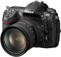
We used a digital SLR camera to take the pictures for our photo story board. I found the camera easy to use because I had used one before and also because we used the automatic function on the camera which meant that we didn't have to change any settings. To get these images onto our story board we used the sd card to transfer the images onto the computer and then into photoshop.
I feel that we could have been more organised in knowing exactly when we were going to film each shot so that we could get filming done in the shortest amount of time possible so that we could get more time editing. To improve on this we could have written a timeline of some sort where we would write the times and dates of when we would film each shot.
 We then uploaded the footage into onlocation using a fire wire. Onlocation allowed us to capture the parts of the film we wanted. We then opened these files on Premier.
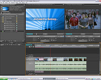 To edit the clips we used Premier. I found this program difficult to use at first but quickly became comfortable using it. To cut the clips down to the length we needed, we used the cropping tool. I think the outcome could have been better maybe if we had more time to edit it. We didn’t face many difficulties; however it was quite difficult because some shots were quite short and it became hard to crop them.
It has been helpful using blogger to display our work because it was easy to organise work and present it well.

I feel that we could have been more organised in knowing exactly when we were going to film each shot so that we could get filming done in the shortest amount of time possible so that we could get more time editing. To improve on this we could have written a timeline of some sort where we would write the times and dates of when we would film each shot.
I found using the digital video camera was quite easy as I had encountered these before. I was also confident with using the camera with a tripod. However, it was a bad idea look at any work we had filmed as it could have meant that we would tape over our existing film.
 We then uploaded the footage into onlocation using a fire wire. Onlocation allowed us to capture the parts of the film we wanted. We then opened these files on Premier.
  To edit the clips we used Premier. I found this program difficult to use at first but quickly became comfortable using it. To cut the clips down to the length we needed, we used the cropping tool. I think the outcome could have been better maybe if we had more time to edit it. We didn’t face many difficulties; however it was quite difficult because some shots were quite short and it became hard to crop them.
To get the video onto my blog, we first had to put them onto YouTube so we could then copy and paste the URL into our blog.
It has been helpful using blogger to display our work because it was easy to organise work and present it well.
Subscribe to:
Comments (Atom)


